My product is the most commoditized thing on the internet. So I stopped trying to make it prettier.
I run about the most commoditized product on the internet: a URL shortener. The entire job is done the moment a 302 leaves the origin. There is no feature you can bolt onto a redirect that changes what it fundamentally is — every competitor does the same thing, in the same handful of milliseconds.
So when I sat down to redesign toui, “make it prettier” was never going to be an honest answer to anything. Decoration on top of a commodity is still a commodity. Just with better lighting.
The idea that reframed the problem
Muneaki Masuda built some of the world’s most beautiful bookstores by refusing to compete on books. You might know him by the tag the press gave him, “Japan’s Richard Branson.” He founded Tsutaya, and his Daikanyama store — a “library in a forest,” built in 2011 — has become a pilgrimage site for designers who’ve never bought a single book there.
His own account of it, in a book called Intellectual Capital, is blunt: once products are abundant, the product stops being the differentiator. What’s scarce is design — the judgment that turns an idea into something people can feel. Tsutaya never really sold books. It sold a proposal about how to live, and the proposal was made visible on a shelf.
I kept coming back to that, of all things, while redesigning a short-link service.
Translating the idea, not decorating the redirect
So we didn’t make it prettier. We took the one idea the whole product is actually built on — a link belongs inside your AI workflow, and every link is really a question: where to? — and tried to translate it into things you can see.
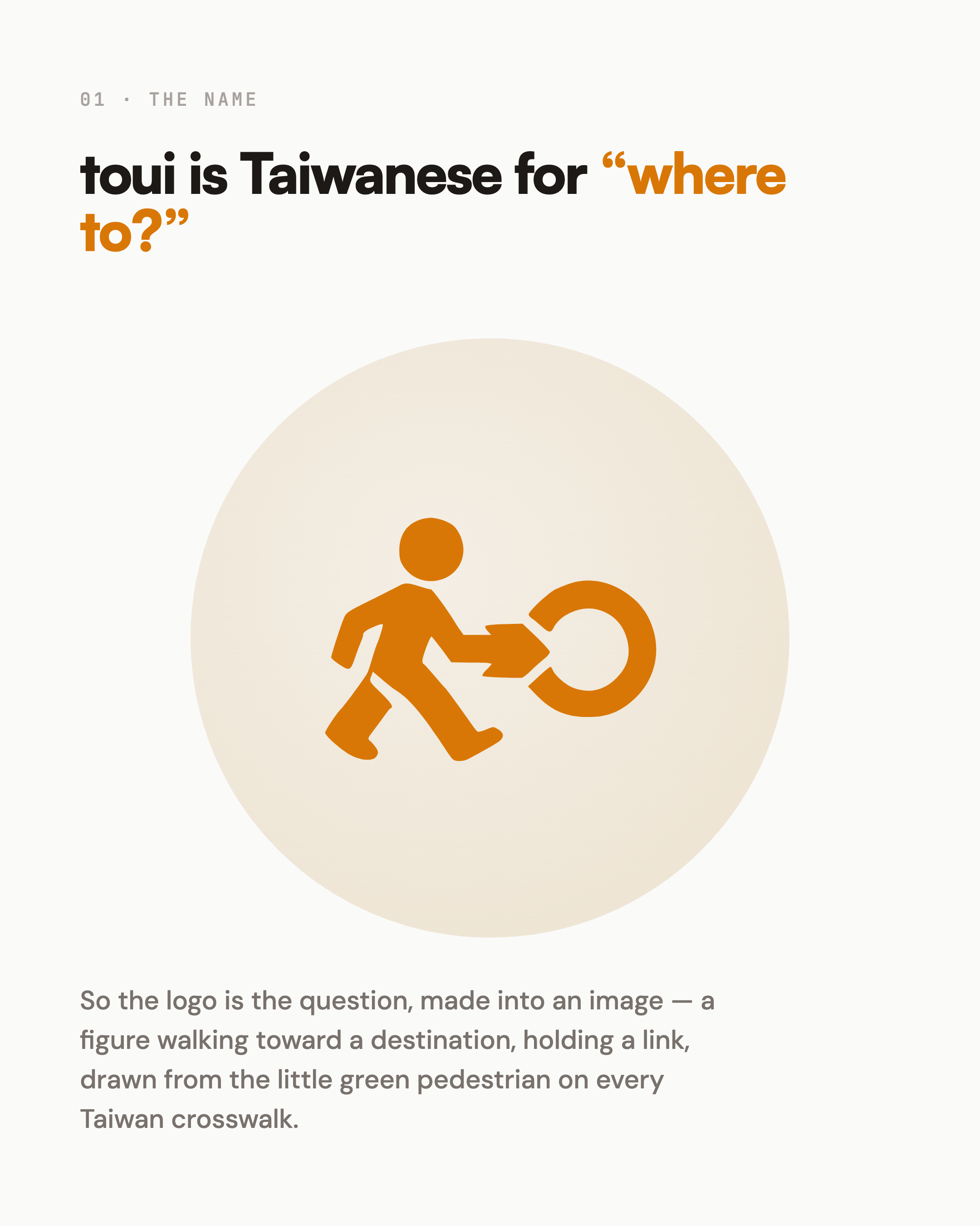
The logo isn’t an abstract mark. It’s a figure walking toward a destination, holding a link — drawn from the little green pedestrian on every Taiwan crosswalk signal. “toui” is Taiwanese for “where to?” So the mark isn’t decoration sitting in a corner. It’s the question, made into an image.
The hero isn’t a screenshot or a slogan. It’s a live conversation, streaming, because the most honest way to say “this lives inside your AI workflow” is to show the product happening inside one — not to write the sentence and hope you believe it.
“Embedded” isn’t a word on the page. It’s a picture: the walking figure steps into a warm circle that means your workflow. If the idea is that the product lives inside something, the picture should show it going in.
And we deleted the safe SaaS blue. One warm note on a paper-colored ground, instead. When everyone around you is quiet and minimal, the difference isn’t a louder color — it’s restraint, whitespace, and finishing the corners nobody puts on a comparison table.
None of that is a feature. All of it is the product.
What I took away
Masuda’s lesson, ported to software: when the function is a commodity, design isn’t decoration — it’s the argument. The one thing a competitor can’t copy isn’t a feature. It’s the idea you managed to make visible.
A redirect is still a redirect. But I don’t think about the redesign as “making toui nicer” anymore. I think about it as the only honest answer left, once the function itself had nothing left to say.
I build toui.io — still just a redirect, now with an idea attached.